|
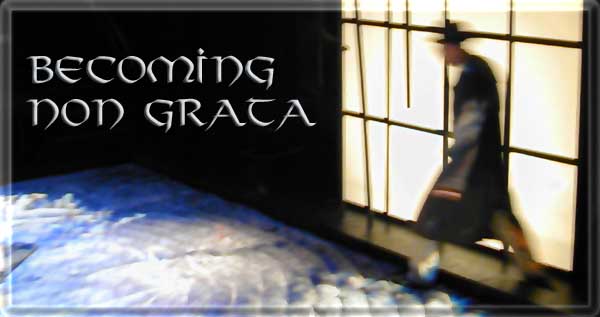
Context/Pretext
While this show was one of
the best I have ever worked on from an audience perspective, it
was clearly one of the most frustrating work situations. The show
traced the life of those in and around Colorado's Amache camp for
Japanese Americans, active during World War II. The show
opened about a year before the 9/11 tragedy in America and the
insights of the show dealing with the slippery slope of erosion of
civil rights at a time of fear in the general society was eerie in
this new context.
Many factors though made the
show frustrating to work on. First it was nearly totally improvisational
in its development, yet called for complex lighting both in plot
and in cueing, very difficult without a script or even good
outline in hand.
The production was also the
first to be presented in the black box theatre space of the new
King Center for the Performing Arts. Many of the systems
were still not complete when we had to open. For instance the
space's worklights still had no switch to turn them off! We had to
go to another part of the building and hand push relays that had
no control wires yet leading in!
and that was before the weirdness
set in! We had our standard manufactured seating risers and seats
installed and then the powers that be insisted that only non-combustable
seating materials could be used - flame-retardant was not enough!
They literally required 100% metal seating components, and this
was within a week of the theatre's opening!
I remembered that the
school's athletic department had abandoned some aluminum/steel
athletic bleachers outside the university's phys-ed facility. We
were able to borrow these but then we had the problem of audience
safety from falling off the units (strange that no one had the
same concern when these were used in sporting events!) In
the end, believe it or not, we had to surround each of the 4 units
used with chain link fence! The only break in all the craziness
was that as the show represented a concentration camp, the metal
seating and fencing fit right in. But audience members swore they
would never come back unless there were "real" seats to
sit on.
Another factor that made
this difficult to work on was the fact that there was no
designated scenic designer. This too was improvisational. The
problem with improvisational scenery is that it has to be BUILT
and that means plans, and real money to spend etc. While
this process was agrivating, the final look was indeed quite
striking.
Last, since the facility was
out of construction money we were informed at the last minute that
no lighting equipment would be purchased in time for the opening!
But since all our resources had gone into getting the facility
open, there was no real money available to rent lighting
either. So this very ambitious project had to be done by the
seat of our pants.
Actually, the challenges
continued after the show opened. The show was so successful
dramaturgically that it was selected to tour to the regional
finals of ACTF in Kansas where the move-in time is severely
restricted. Since the show was designed around 9 tons of sand this
was.....a challenge!
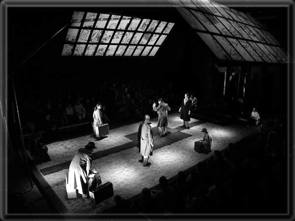
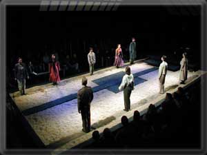
Physical Description:
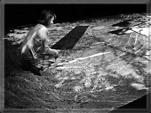
The scenery consisted of a
rather large sand pit, about 18' wide by about 40' in length with
a wood 1' wide border surrounding. At one end is a vertical
Japanese screen about 25' high designed to be lit from the rear
with a modern sculptural representation of a tree in front. At the
other end is a wooden tower structure with a makeshift look. Onto
this tower structure, above and below, could be attached more
screens and in fact at the start of the show, the screens were
attached. The space looked very Japanese at the start, but as the
tower screens came down, some becoming planks to bridge the sane,
the tower took on the look of the camp guard tower.
Even though our theatre was
brand new and industrial strength, the engineers ruled that the
weight of the sand would exceed the floor's rating. Besides it
would take too much time to move it all in or out, so the bottom
4" of the sand pit was taken up with sheets of poly-styrene
with the sand placed on top. This also helped to protect the
theatre's new floor. Still, with only 3-4" of actual sand,
the weight was still something like 9 tons!
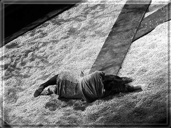
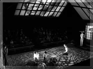
At the start of the show,
the sand was pristine, with beautiful raked patterns.
Needless to say, the
generated dust made for a very problematic environment to work in.
When the show was remounted
to move to Kansas, a wonderful and truly collaborative technical
solution was developed. Not only was the sand deemed necessary as
a visual element; it was also a necessary audio element, and often
the sand became a prop element too, with various things buried in
the sand and sand blocked to stream from the fingers of the
actors, etc.
But the theatre in Kansas
simply forbade the use of sand in the production, and given the
limitations of time in the space, we were not disappointed in this
restriction.
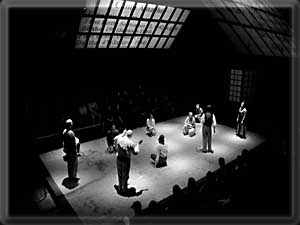
What we ended up with were
sheets of plywood, loosely covered with muslin. Into the muslin
was stuffed gobs of packing peanuts, making the structure about
5-6" thick. Then furrows were stapled into the muslin (as it
was being filled) along strict design patterns. The look was
somewhat like one of those plastic beach rafts, but once painted
and on stage, these units together looked exactly like the sand as
raked into its design pattern at the top of the show! The
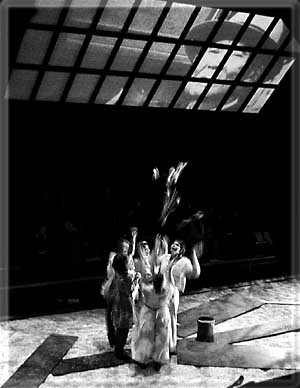
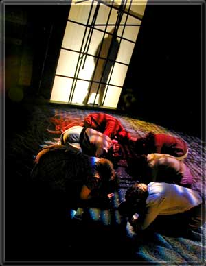
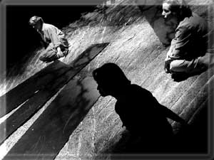
units even crunched like sand when walked on. In the photos above,
the first two show the cloth "sand" and the next two
shots show the real sand. Pretty cool, no?
The seating was on two
sides, which is often a disaster as an audience-stage
relationship. Given the content of this work, the spatial
arrangement, and the choreography this mode worked extraordinarily
well in this case.
Above the space, two 45
degree angle Japanese screens were hung to receive both rear and
front projection images and texture.
Lighting Scheme:
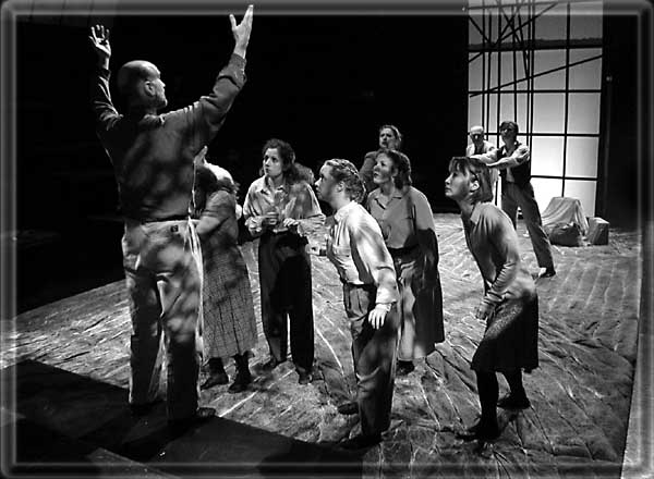
This project was approached
somewhat like a dance project. Indeed at least half of the story
of Amache was told through movement. The show presented many
"worlds". There was the past (in various periods) and
the present. The Japanese and the Americans; the military and the
civilian; the truth and the distorion; the public and the private;
and even the good and the evil.
In this context, as the
lighting designer, especially with limited resources at my
disposal, I opted for a disciplined approach based on contrasts.
There were a number of layered systems in my scheme. First I
set up three axes of composition: The long axis, (sidelight to the
audience); downlight for toning and more often, isolation; and
diagonal, from the corners, for texture.
The sidelight provided for a
stark key light. It was divided into 9 strict zones from each end
of the space. It was important for regions of the space to be able
to be lit as separate units and this scheme worked. The sidelight
also allowed for a film-like composition. As the action would
shift to one of the political or military speakers, for instance,
the light could shift to shine directly into their face. This was
most striking in situations where there was a call and response
between the speaker and the chorus. In these instances the
direction of the lighting could at an instant, shift 180 degrees
for a very powerful pictorial moment.
The starkness of the
sidelight could be mitigated by a series of 8" fresnels used
as downlight. These mimicked the feel of an overcast sky when
blended properly with the sidelight. The sidelight was of
no-color and thus it could appear warm is low in dimmer or like a
bright incandescent white. To be able to move more towards
daylight white, another set of 8" fresnel downlight was
employed in a deep blue. These could make the white quite cool.
They could also mitigate the red shift when other lamps were at
low reading. Finally the units could provide for a field of deep
blue into which specials could cut.
Another layer of downlight
provided for 12 pools specifically as specials. The geometry of
these pools though was such that although each was distinct, they
could be used individually on actors, or in groups almost like
gobo-light to provide a texture or starkness.
From the corners into the
space came a gobo pattern of branches. This light provided a stark
contrast to both the sidelight or the two layers of downlight.
When used together these basic layers could
provide for a myriad of lighting possibilities.
This new theatre space
featured a tension lighting grid that also made it possible to
place two source-4 units on the grid as follow spots. These could
also double as search lights.
Another important layer of
lighting consisted of 4 shin-busters - tough to implement in a
non-proscenium space. These were placed at the corners of the sand
box and allowed performers to be totally isolated from the floor;
an especially valuable asset when projections were employed on the
floor surface.
The screens on the set and
above all had backlight, and gobos to play on them with image
projections as well on the hanging screens. There was also a set
of deep red wash lights from the direction of the audience for use
in key points of the show.
Each of these carefully
planned layers could be used individually or in tandem with the
other systems to provide a very fluid lighting environment that
would shift in space and emotional content in a very cinematic
way.
In the first iteration of
the production, I employed quite an old-school approach to the
screen projections. We used simple overhead projectors, hooked
into an old variac dimmer (so the motors wouldn't freak out too
much as they do with electronic dimming). These old
projectors are really quite bright, brighter than most video
projectors affordable to a University, and the field is much
wider...great for large screens at a short throw. But best for us,
the use of these projectors allowed us to keep up with the
improvisational nature of the show through use of a simple Xerox
machine and ink-jet printer. The projectors were modified so
as to eliminate stray and spill light. The projectors were located
between the audience seating sections, and with the stray light
shielded, they were essentially invisible to the audience.
For the tour to Kansas, the
images were all migrated to Ektagraphic Slide Projector format
with the lenses carefully matched to the throw from behind the two
audience sections. Interesting that both approaches worked quite
well but by the second year the show was less improvisational
making it more conducive to the traditional projection approach.
In the first production, an
Ektagraphic projector was placed on the tension grid and with the
use of a mirror, focused onto the sand pit. With a 1.4"fl
lens the image largely filled the pit. When the actors were lit
with the shin-busters they would appear to float above the
projection. In Kansas two sets of gobo patterns from above
were used as a substitute.
|